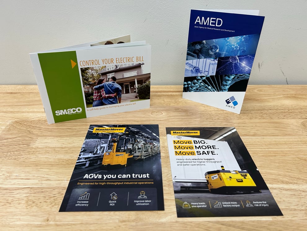
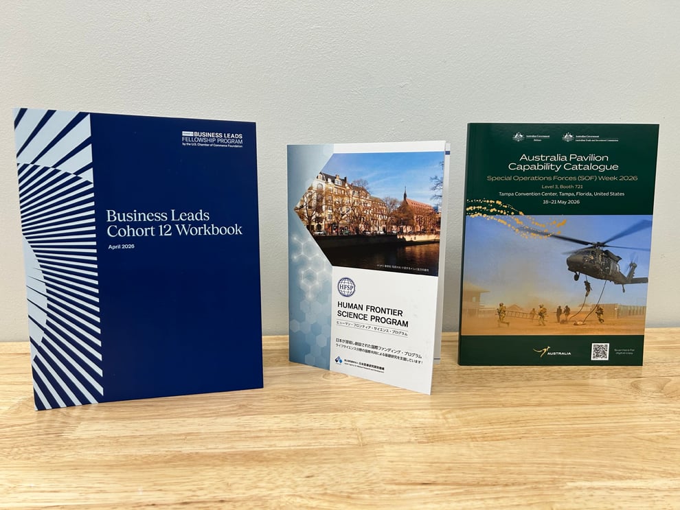
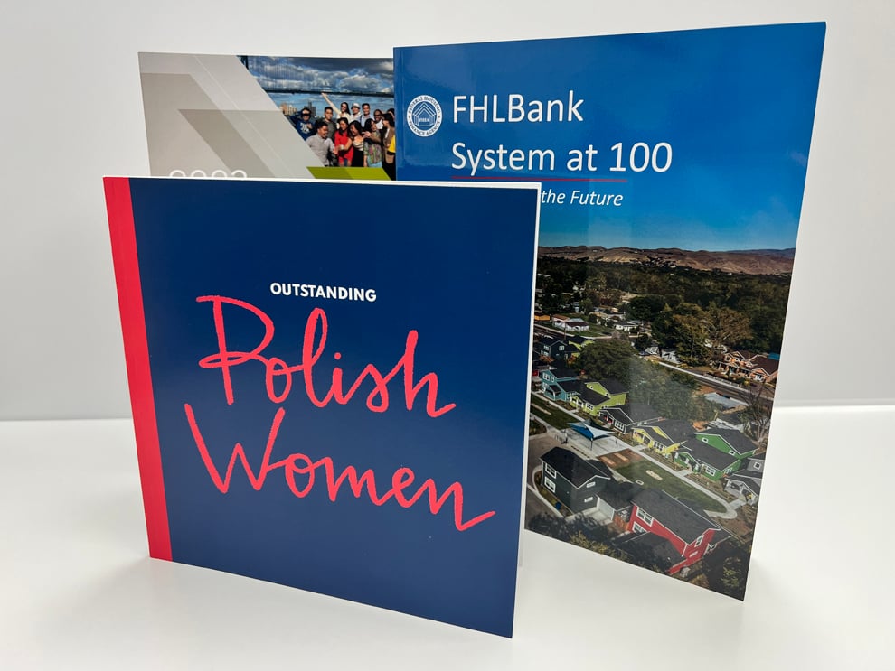
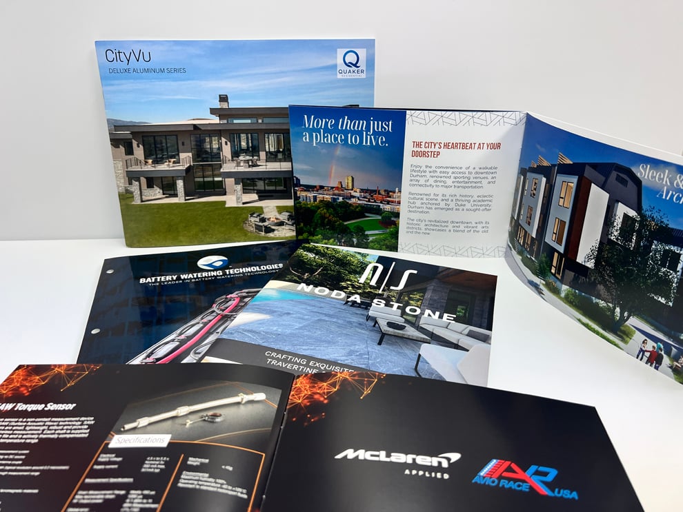
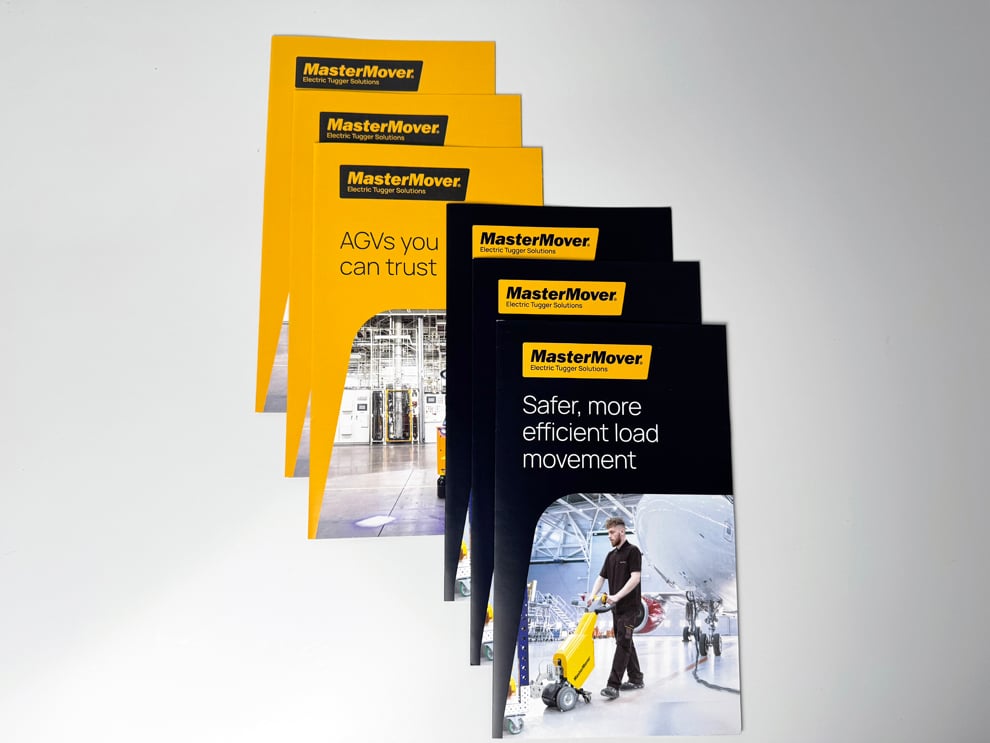
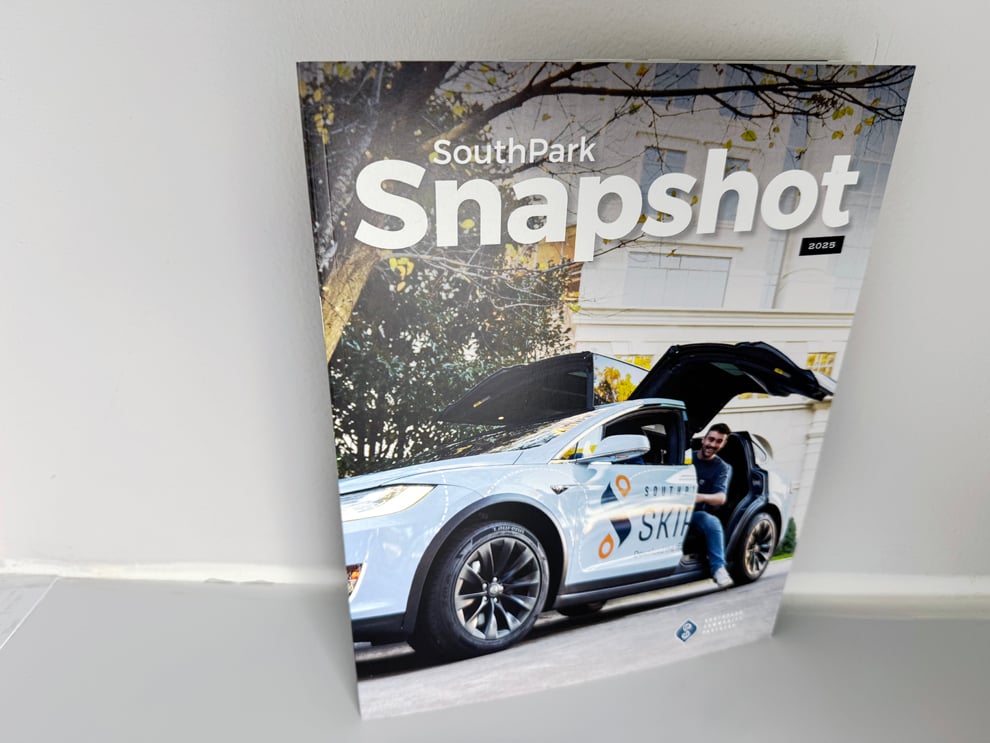
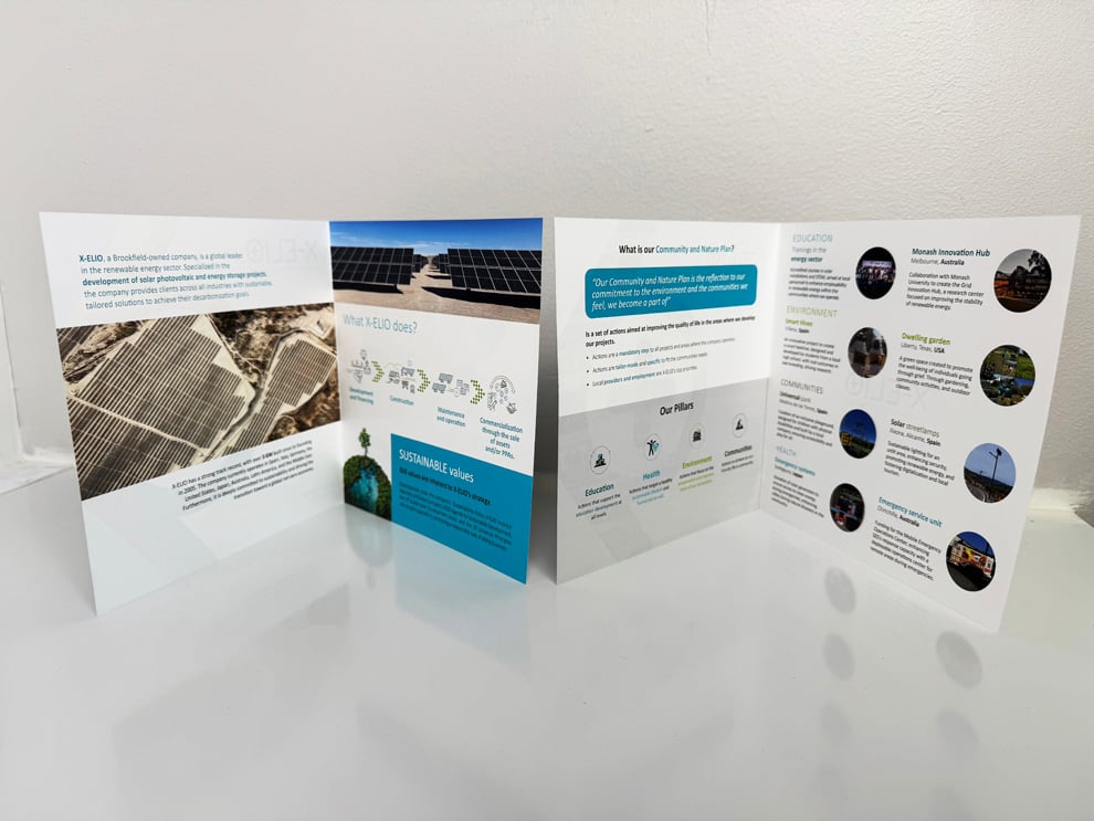
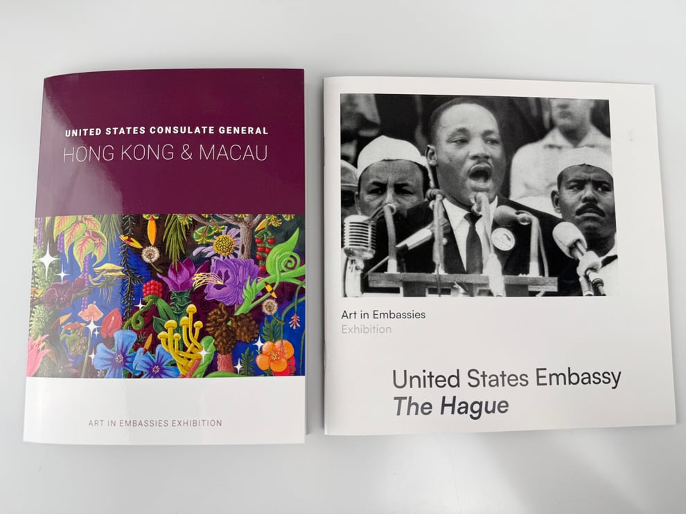
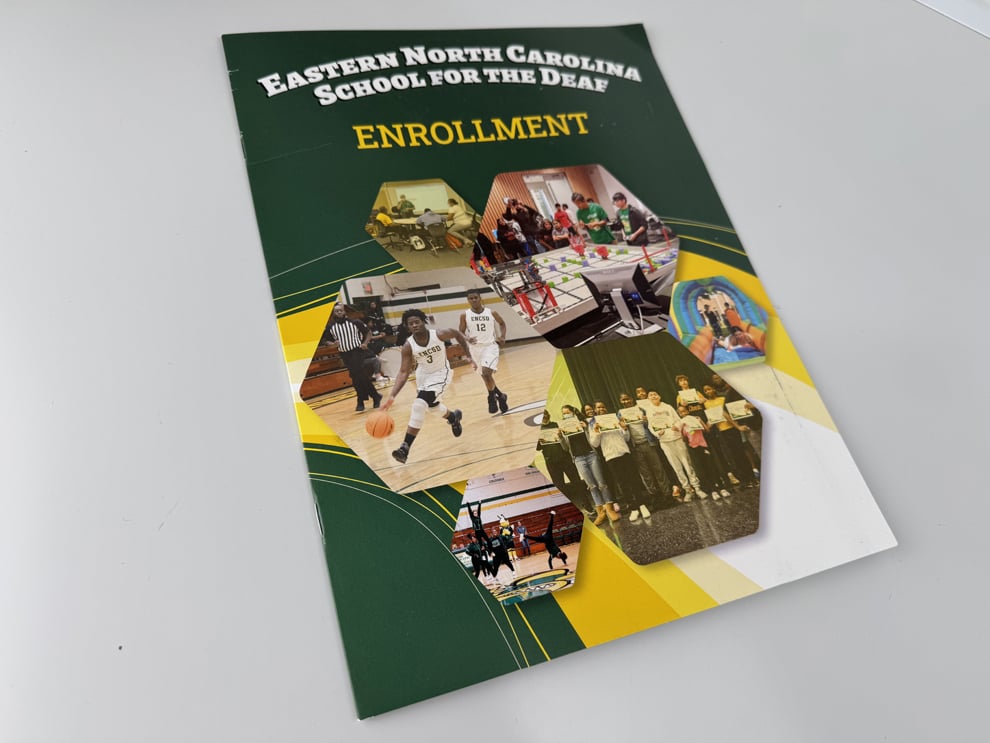
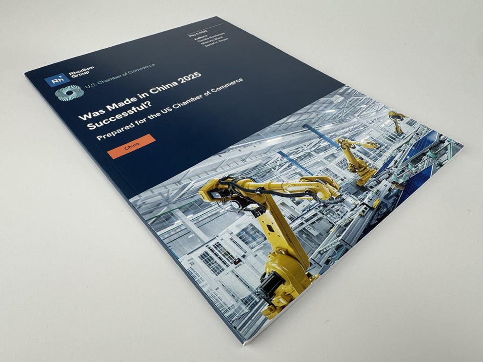
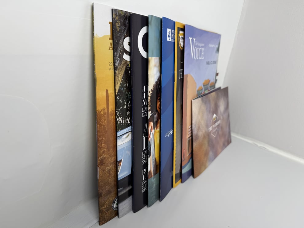
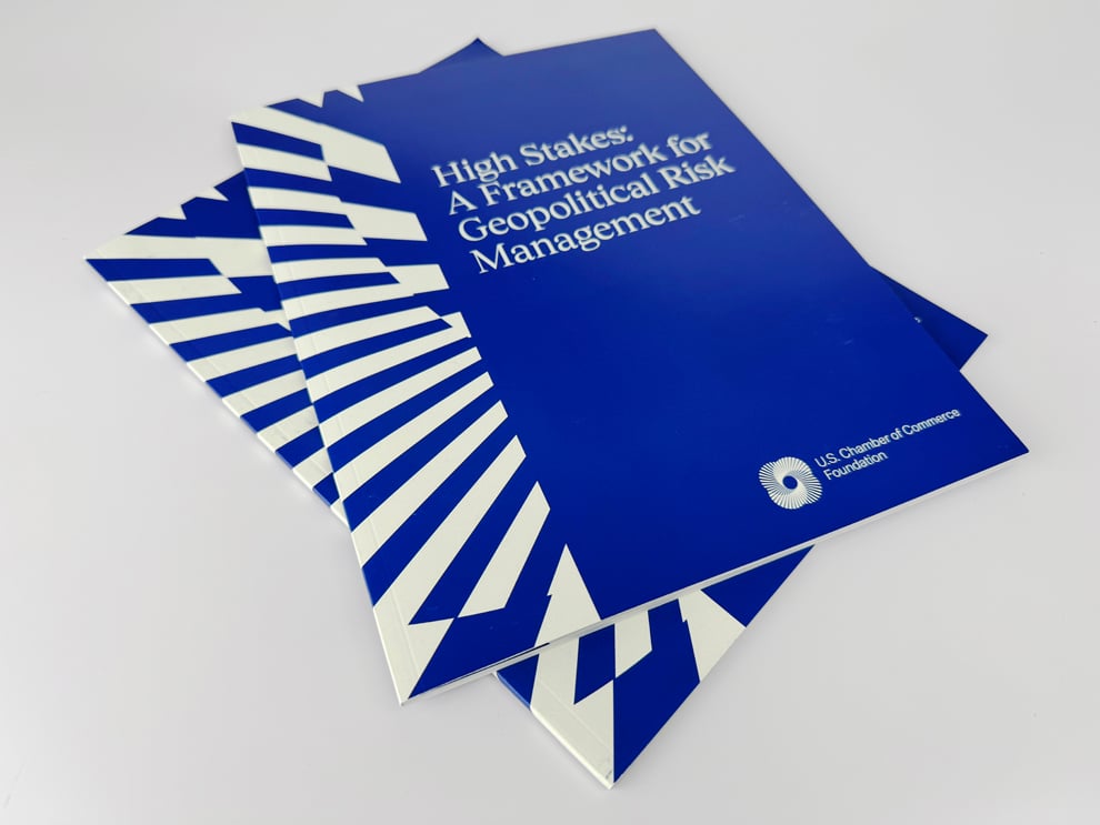
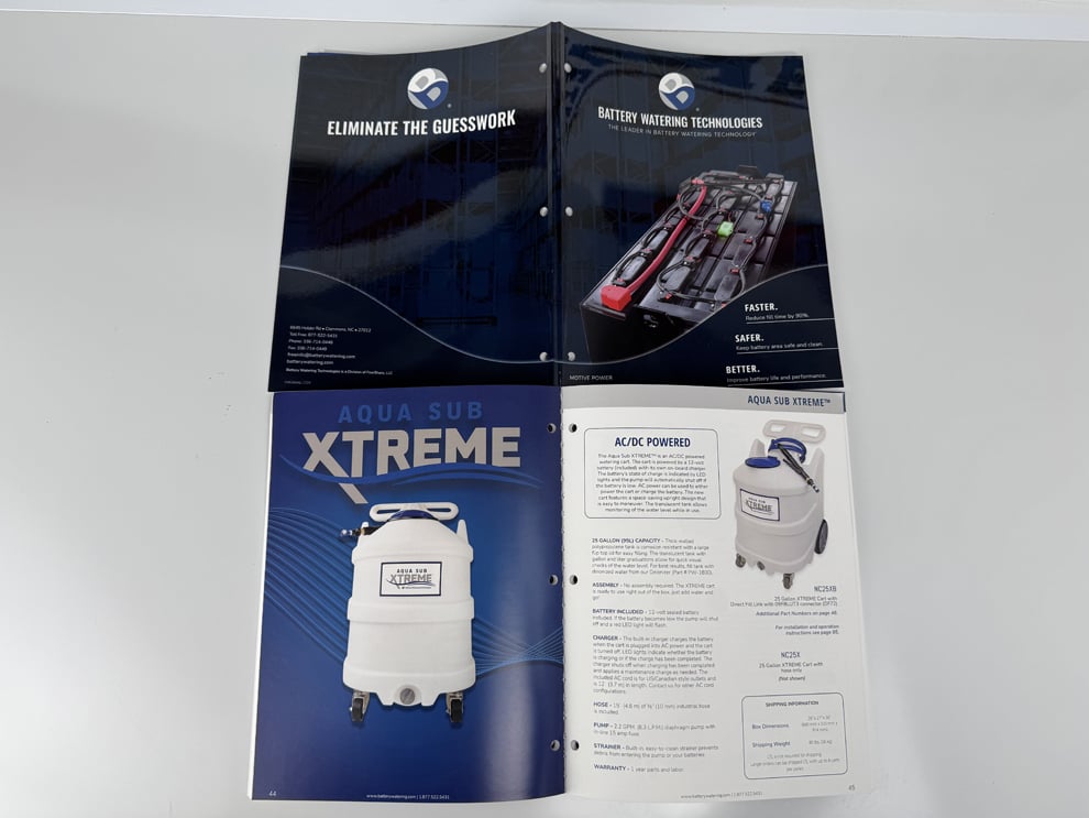
Some brochures depend almost entirely on images. A residential community, a renovated downtown property, a hotel, a wedding venue, or a new medical office often makes its case through photographs before a single paragraph is read. Greenville's growth has produced plenty of these projects, and their brochures need images that look as good in print as they did on the photographer's screen.
Heritage concentrates on that translation from screen to paper. Using your completed design, we review image placement around the folds, manage color with professional measurement and production-specific profiles, and print on the paper you have selected for the look you want. You approve an electronic proof before production, confirming the layout, images, and copy.
Good photo reproduction is partly technical and partly practical. Skin tones, interiors, food, landscapes, and twilight exteriors each reveal color shifts differently, and some papers flatter them more than others. Raising those questions before the file is final helps the brochure arrive looking like the property or experience you are presenting, not a dimmer version of it.
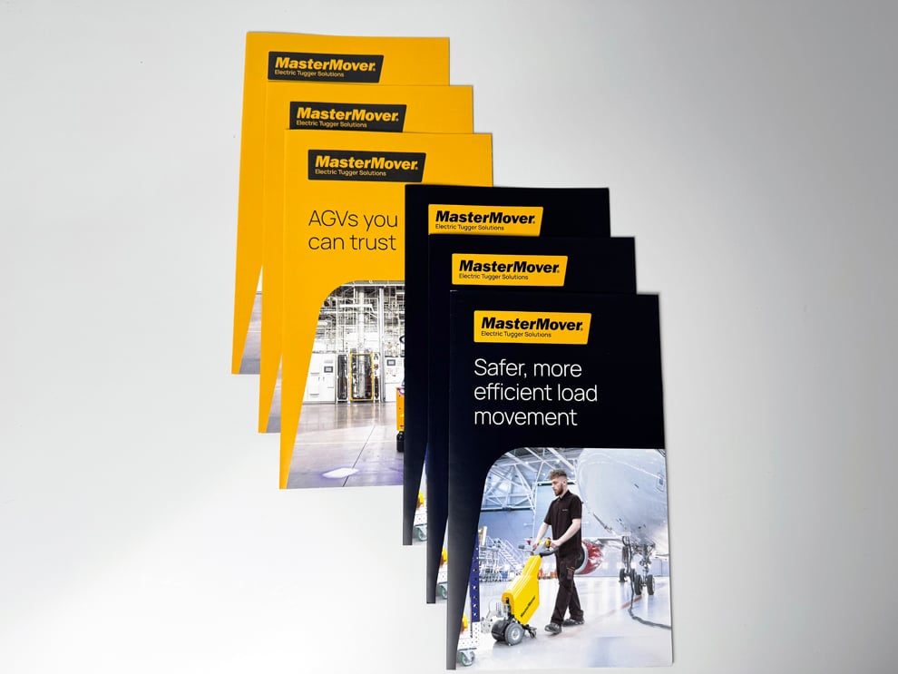
Photography is expensive to produce, and a brochure that prints it poorly wastes that investment. Heritage has been printing since 1977, and we know how much the final look depends on decisions made before the press runs: image resolution, color handling, paper surface, and where each photo sits relative to the folds.
Our color-management practices include spectrophotometric measurement, calibration verification, and production-specific profiles where relevant. Those tools help keep color consistent within the capabilities of the chosen paper and finish. They do not turn a monitor into a color standard, which is why qualifying Custom Quote orders can add a paid Physical Production Color Proof on the intended production printer and paper when color decisions are critical.
Service matters as much as equipment. When your team has a question or a date shifts, you get a direct response from a veteran-owned, family-led company. After a qualifying Custom Quote is accepted and the order assigned, your Project Coordinator is the direct contact who understands the images, paper, and finish you approved.
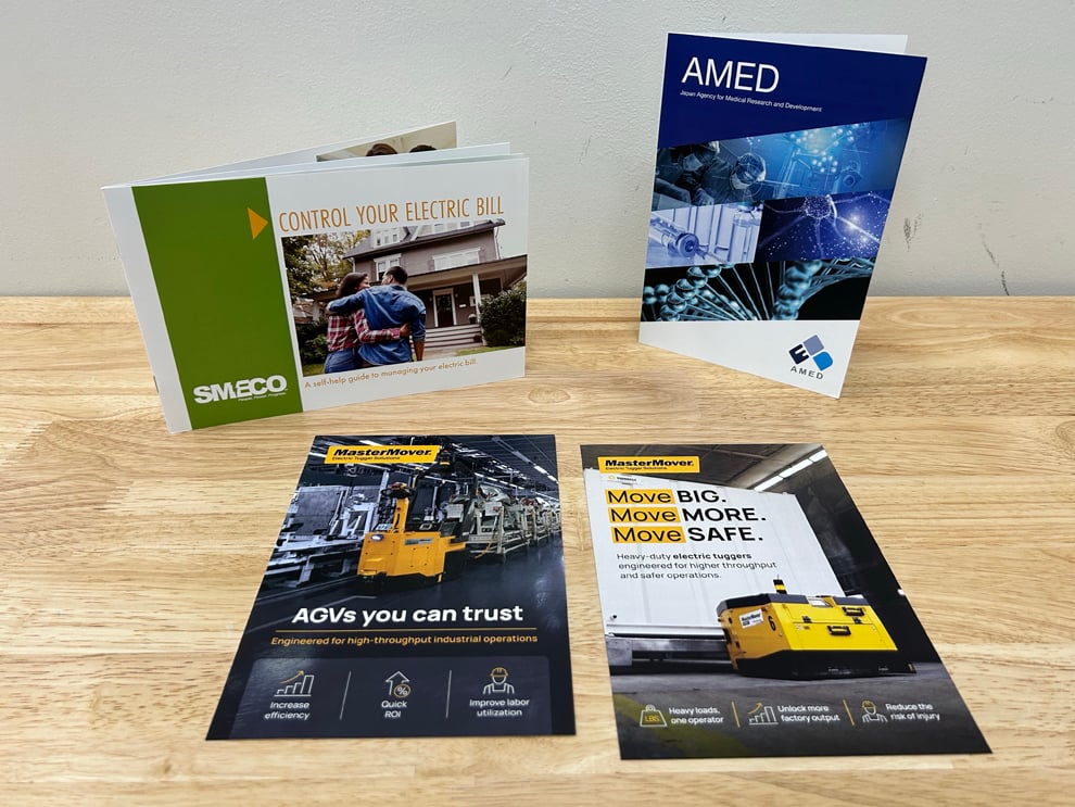
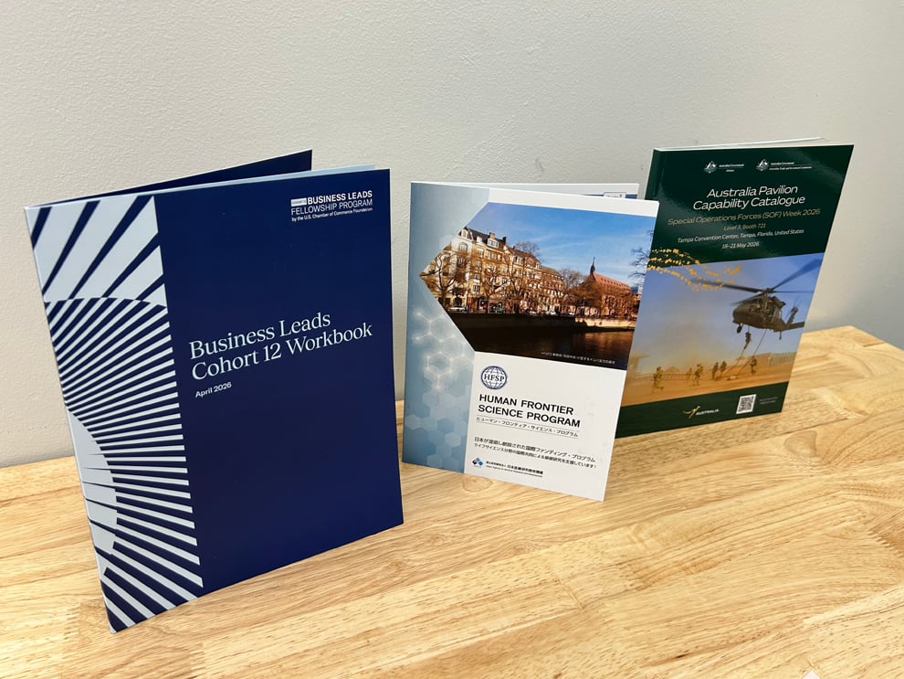
Present a property brochure alongside floor plans, rate sheets, or availability lists in one polished package.
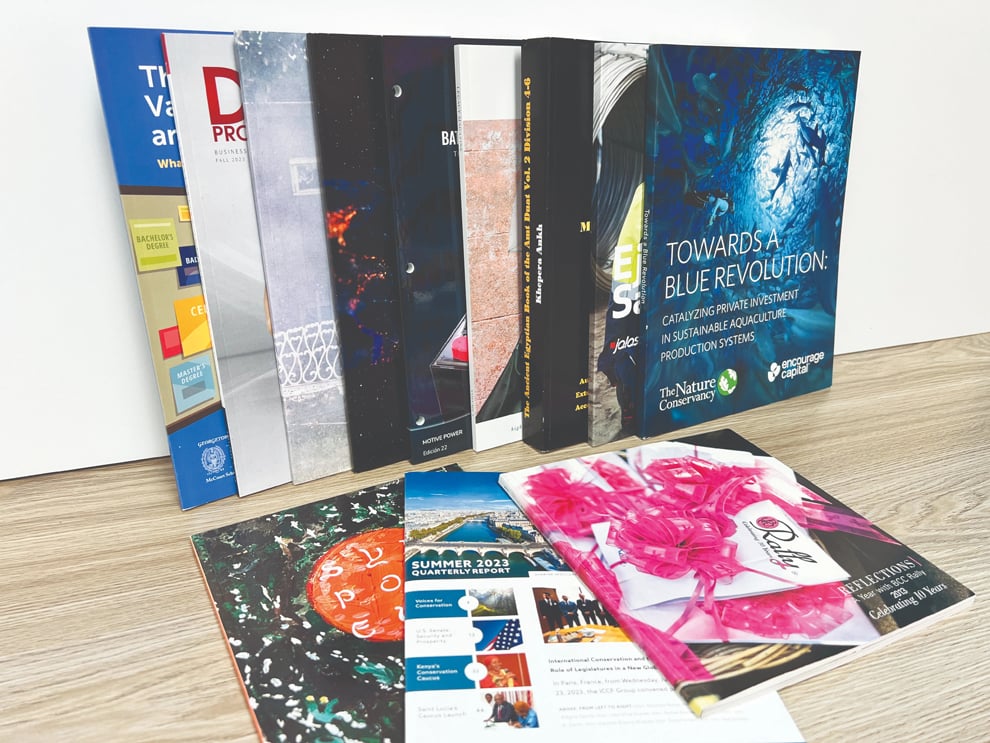
Carry the same photography and brand style into postcards, flyers, and leave-behinds.
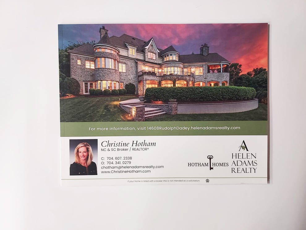
Mail image-led brochures to prospective buyers, guests, or tenants when a targeted list is ready.
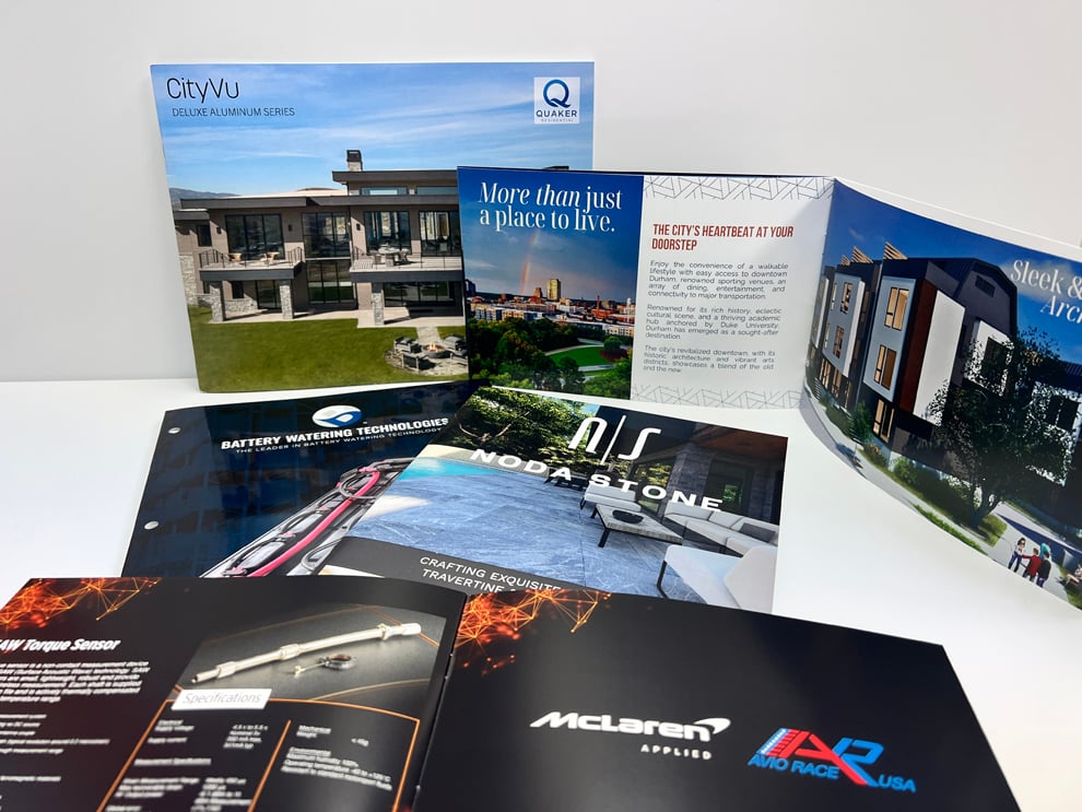
Use more pages when a property story, amenity guide, or portfolio needs room for larger images.
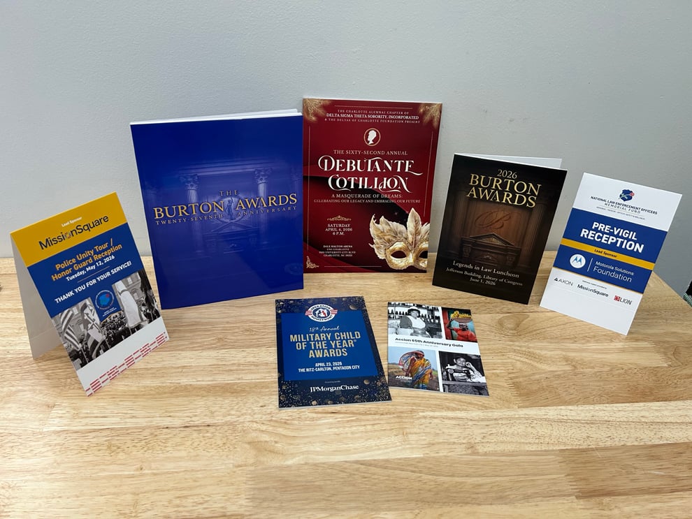
Print programs for grand openings, galas, and ceremonies hosted at your venue.
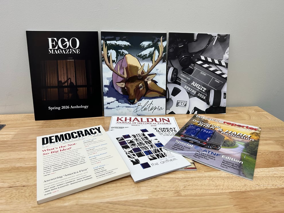
Produce lookbooks, area guides, or resource directories with space for photography and detail.
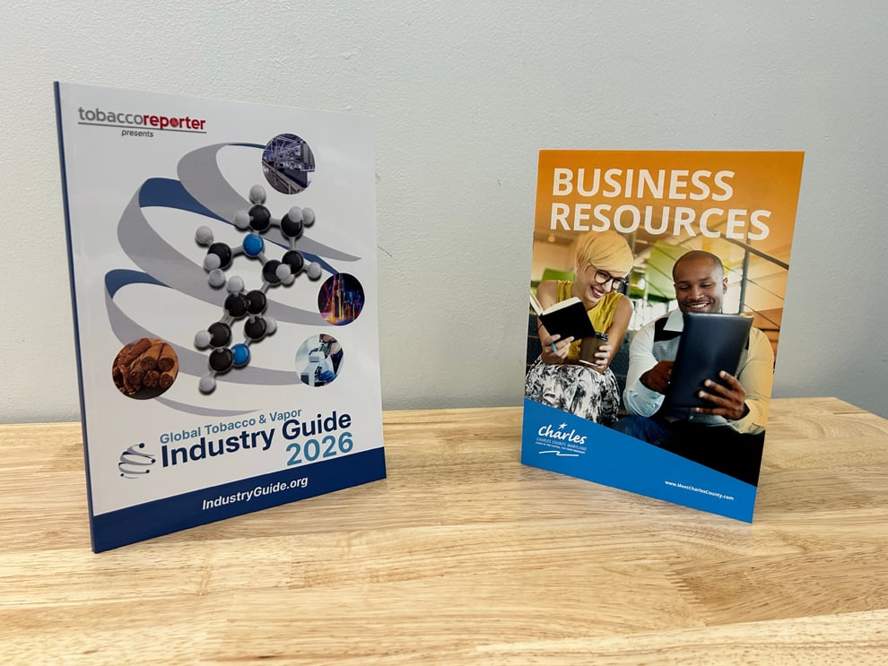
Keep residents, members, or guests informed with a printed update on a regular schedule.
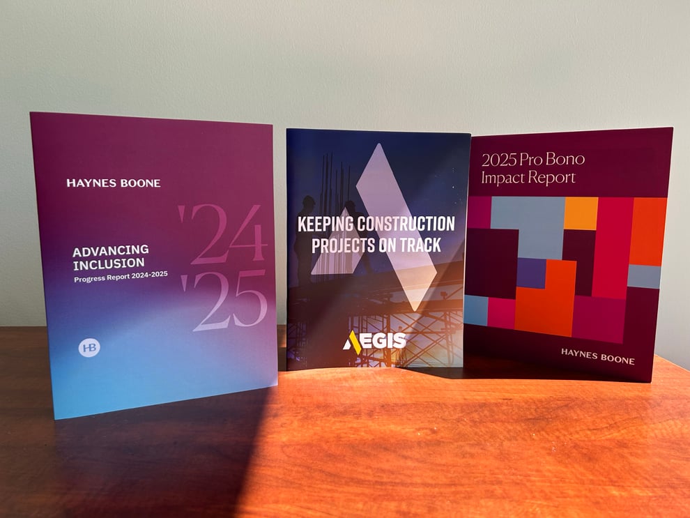
Show a year of growth and milestones to investors, partners, and boards in a formal printed report.
Is the design finished and the photography placed? If the Online Store offers the size, fold, paper, and quantity you want, order directly at Heritage's lowest available pricing. When image color is critical, the paper choice needs discussion, or the file needs production-oriented adjustments, a qualifying order of $2,000 or more can go through Custom Quote instead, with a Project Coordinator assigned once Heritage accepts the quote.
Images that look sharp online can disappoint in print if they were saved at screen resolution. For printed brochures, photos should be placed at full size with enough resolution for print, commonly around 300 pixels per inch at the final dimensions, and edited so highlights and shadows keep their detail. Your designer or photographer can confirm those settings before the file is sent.
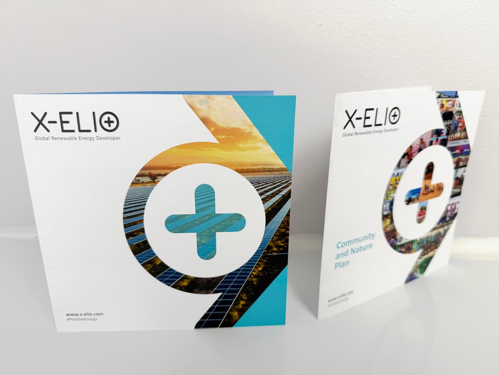
Placement matters next. A full-bleed image that runs across panels looks dramatic, but the fold will pass through it, and normal folding tolerance means the crease will not land on an exact pixel. Keep faces, focal points, and headline text away from fold lines, and let forgiving areas of an image, such as sky, water, or texture, cross the panel edge.
Paper completes the picture. Coated papers generally keep photographs vivid and crisp, while uncoated papers give a softer, more natural feel that some brands prefer. Qualifying Custom Quote orders can include guidance on that tradeoff, and every order receives an electronic proof to confirm image placement before production.
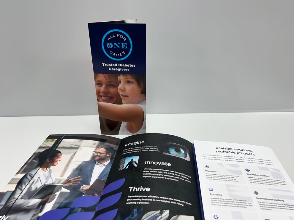
Photos should have enough resolution at their final printed size, and around 300 pixels per inch is a common working standard. An image pulled from a website is usually far below that and will look soft or pixelated when enlarged. Ask your photographer for the original high-resolution files before the brochure is designed.
Not exactly. Screens emit light and can display colors that ink on paper cannot reproduce, so very bright or saturated tones may print slightly more subdued. Heritage manages color with professional profiles to keep the result as close and consistent as the paper allows. A calibrated monitor helps, but the electronic proof is not a color standard.
Gloss makes photography pop and suits vibrant interiors or resort imagery. Matte coated stock keeps images sharp with less glare and a more refined feel. Uncoated paper creates a warm, natural impression but softens photographs slightly. Choose the surface that fits your brand and the type of photography you are showing.
Yes, and it can be striking. Because every fold has normal production tolerance, keep faces, logos, focal points, and text away from the crease. Backgrounds, landscapes, and textures are better candidates for spanning panels because a small shift in fold position will not distract the reader.
It is a paid physical sample printed on the intended production printer and paper so color can be judged before the full run. It is available for qualifying Custom Quote orders of $2,000 or more, not through the Online Store, and it adds time. Once approved, it becomes the controlling physical color reference unless otherwise agreed.
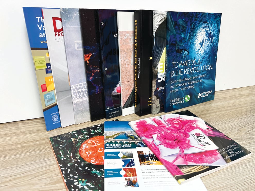
A brochure suits a first impression: a few strong images, key features, and how to inquire. When the story includes floor plans, amenity details, neighborhood context, and a large photo set, a booklet gives each element room. Many developers use a brochure for broad distribution and a booklet for serious prospects.
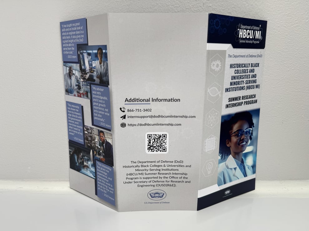
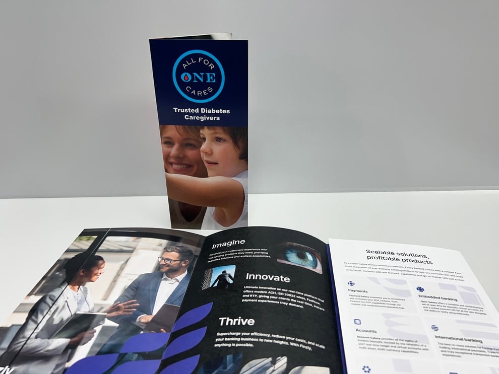
A bi-fold gives the largest uninterrupted panels and a single inside spread for a hero image. A gate-fold, where the specification supports it, creates a dramatic reveal. A tri-fold offers more panels but smaller images. Choose the fold that gives your strongest photographs the most space without a crease through the subject.
They can print beautifully when files are well prepared and the paper suits the imagery. Skin tones and food are sensitive because small color shifts look unnatural, so photographers should deliver properly color-managed files. Heritage manages color with production-specific profiles, and a Physical Production Color Proof is available on qualifying Custom Quote orders.
Yes. A heavier sheet adds weight in the hand that supports a high-end property or venue. Very heavy or coated stocks may need scoring so the fold stays clean and the image surface does not crack. Balance the feel you want with how the brochure will be mailed, displayed, or carried.
A high-resolution, print-ready PDF with images embedded at full quality works best. Avoid aggressive compression when exporting, because it can introduce blotches in skies and smooth gradients. Confirm that every image was placed at its final size with enough resolution, and include bleed wherever photos run to the edge.
It fits qualifying orders of $2,000 or more where photography color is critical, paper choice needs discussion, the file needs production-oriented adjustments, or versions cover several properties. After Heritage accepts the quote and assigns the order, a Project Coordinator becomes your direct contact.
Confirm that each photo is the correct one, cropped as intended, and placed with focal points clear of the folds. Check captions, property names, addresses, and contact details. The electronic proof confirms layout and content, but it is not a physical color standard, so judge color expectations separately.
Yes. Heritage works with developers, hospitality businesses, and other organizations throughout South Carolina, including Greenville and the Upstate. Finished brochures can be shipped or delivered according to the accepted production plan, including split deliveries to sales centers or several properties.
Yes. Versions can swap photography, floor plans, pricing details, or contact information while keeping a shared design. Name each file clearly, list the quantity for each, and assign an approver. Heritage proofs each property's version separately, which keeps rates, plans, and contacts accurate.
It works well when the design is final, the files are print-ready, and the Store carries the format you designed for. You place the order yourself at Heritage's lowest available pricing. If you need paper guidance or physical color review, Custom Quote is the better path for qualifying orders.
When mailing is part of the accepted scope, Heritage can coordinate addressing and postal preparation with printing. You supply an accurate, authorized mailing list in the agreed format. Plan mailing early because size and weight affect postage, and once the U.S. Postal Service accepts the mailing, delivery timing is in its hands.
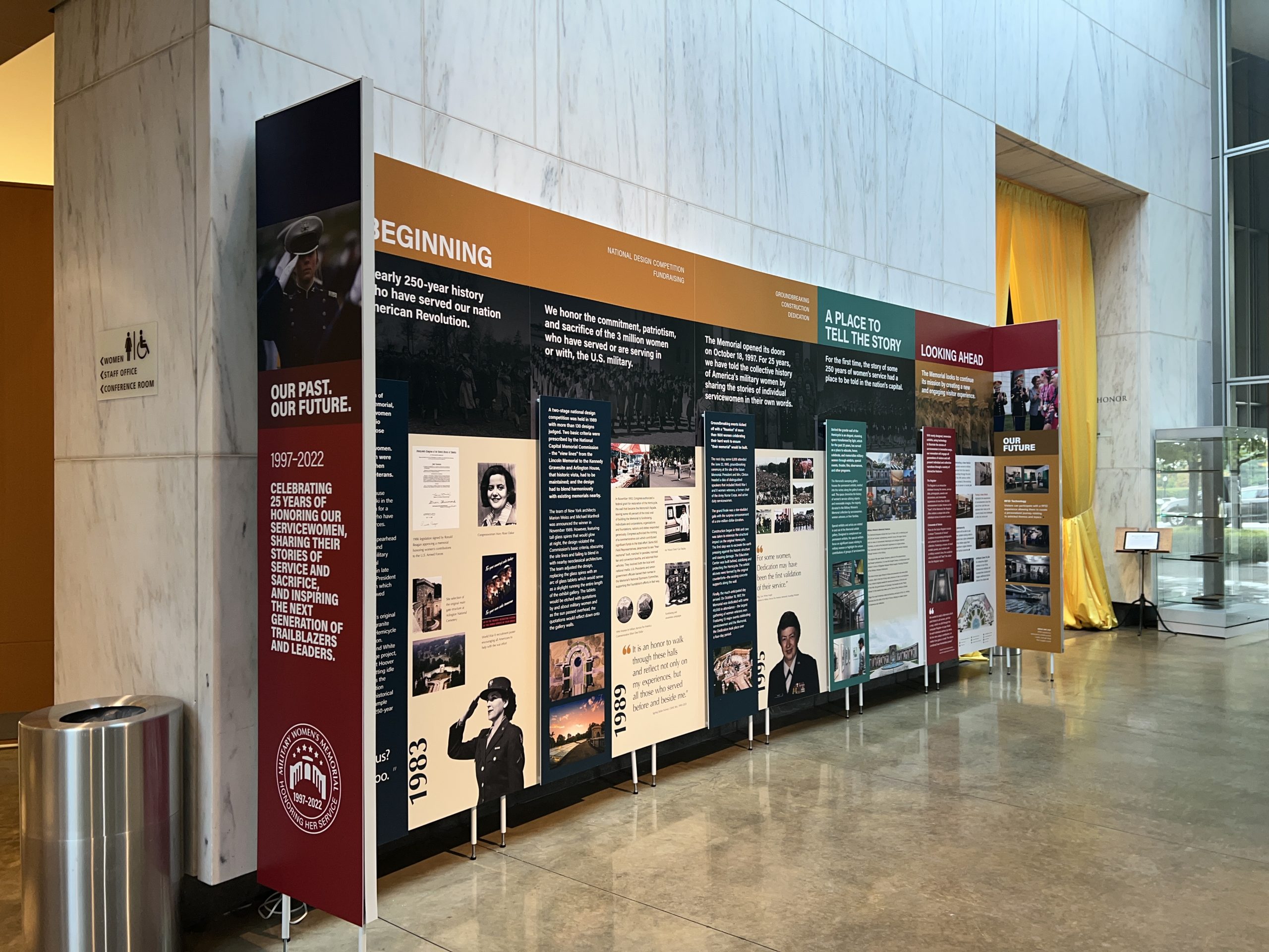
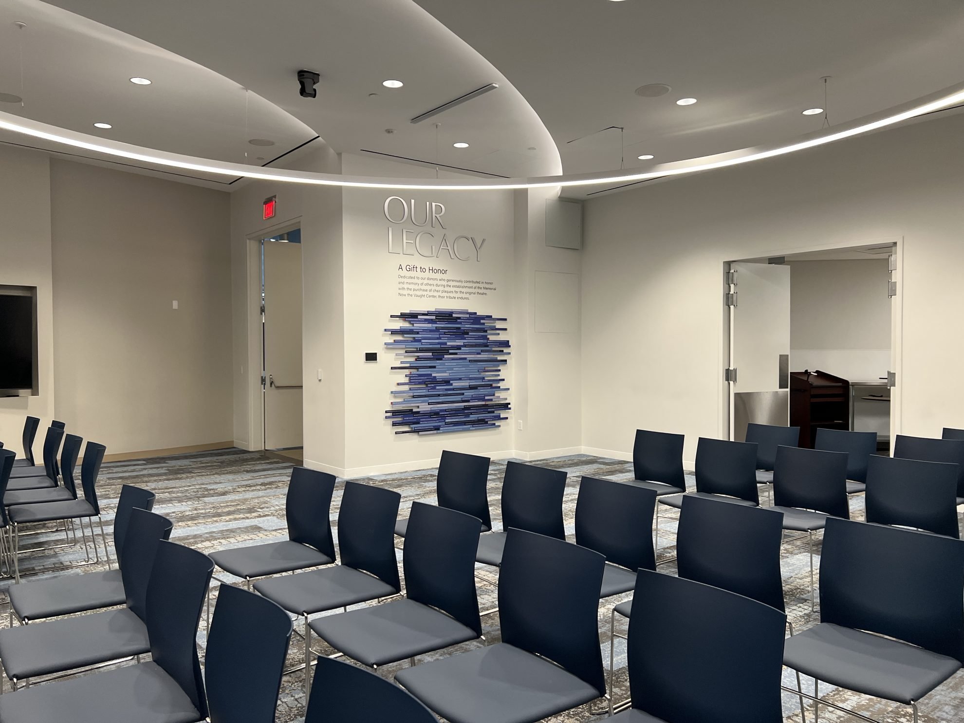
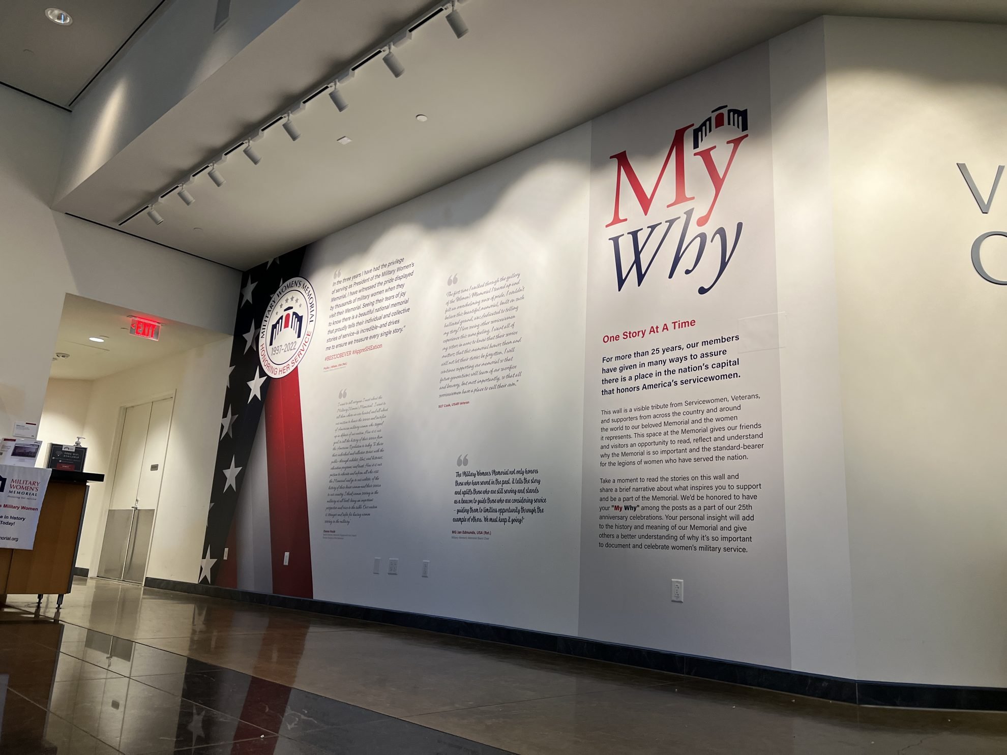
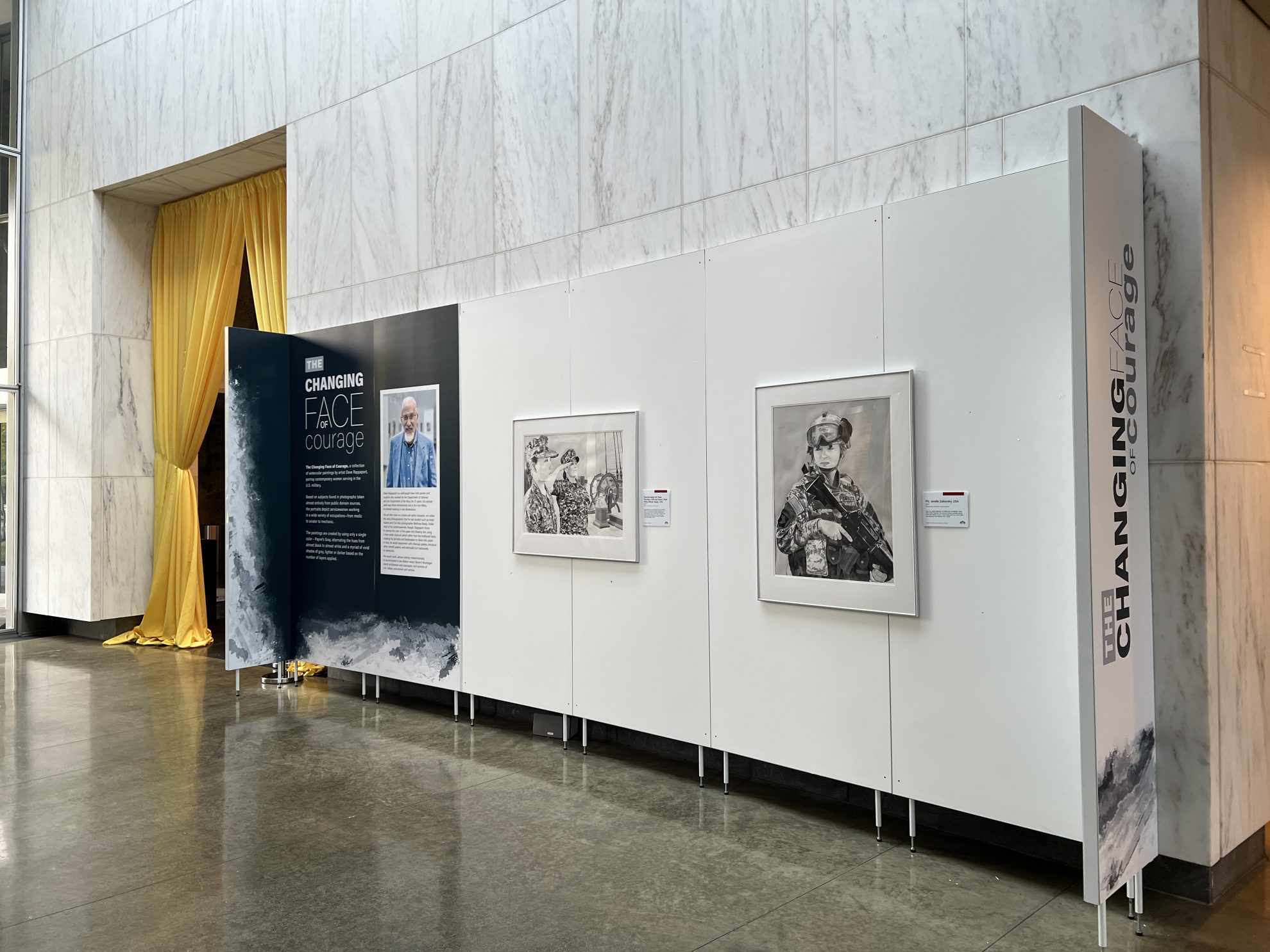
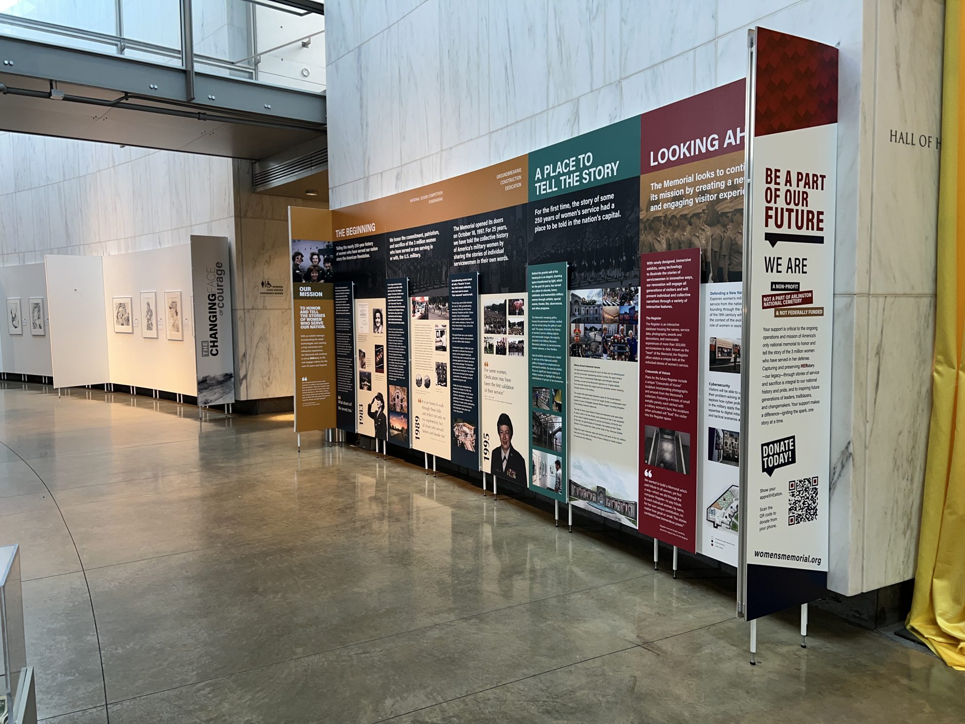
Heritage Signs & Displays created new museum signage for the Military Women’s Memorial in Greenville, SC. The project included custom signs, wall wraps, dimensional letters, and standoff-mounted displays to honor the legacy of U.S. servicewomen and the donors who supported the memorial. The updated interior features impactful designs, including a "Our Legacy" wall display and panels showcasing historical contributions and artwork, creating a transformative tribute to women in the U.S. Armed Forces.
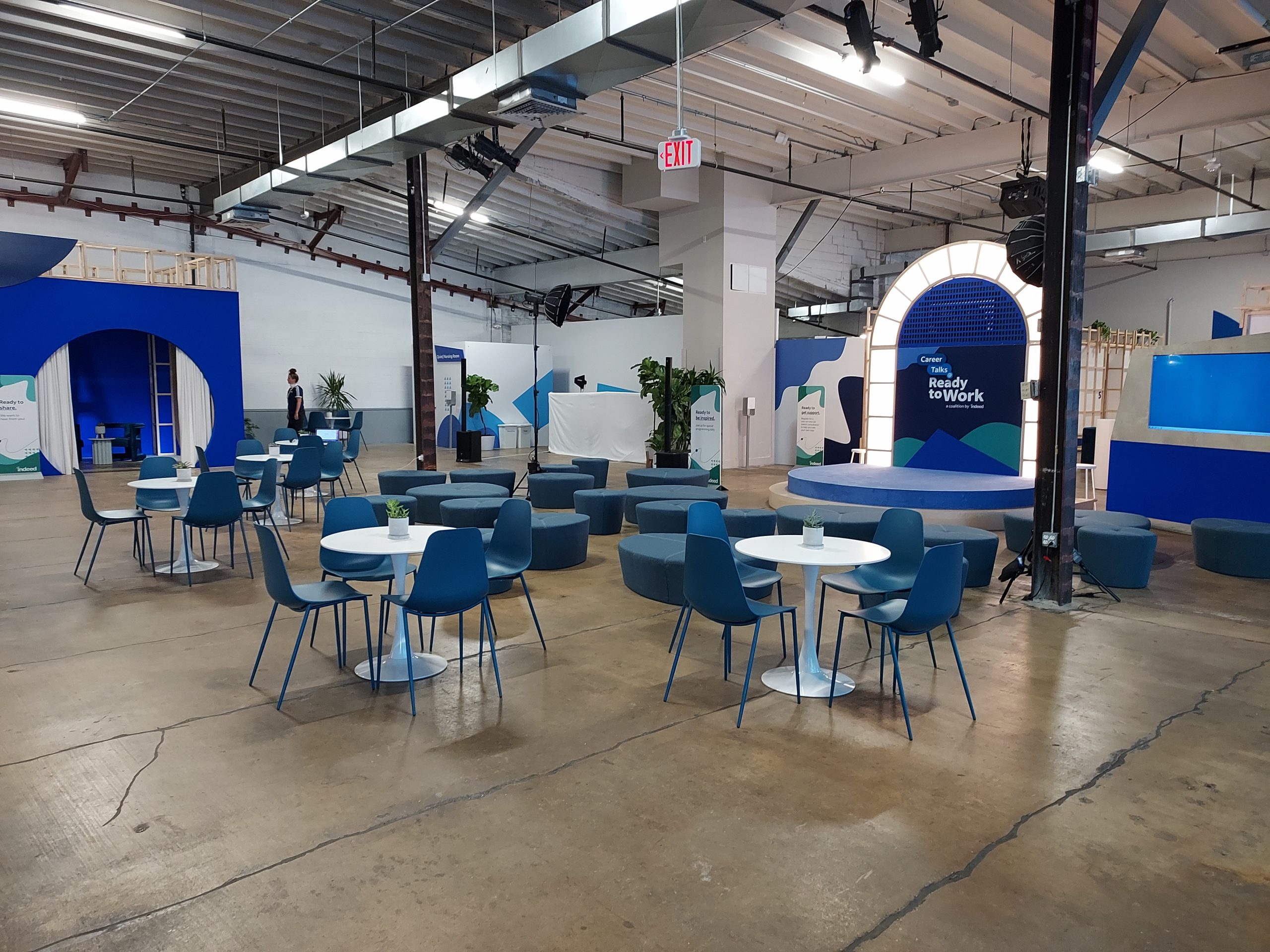
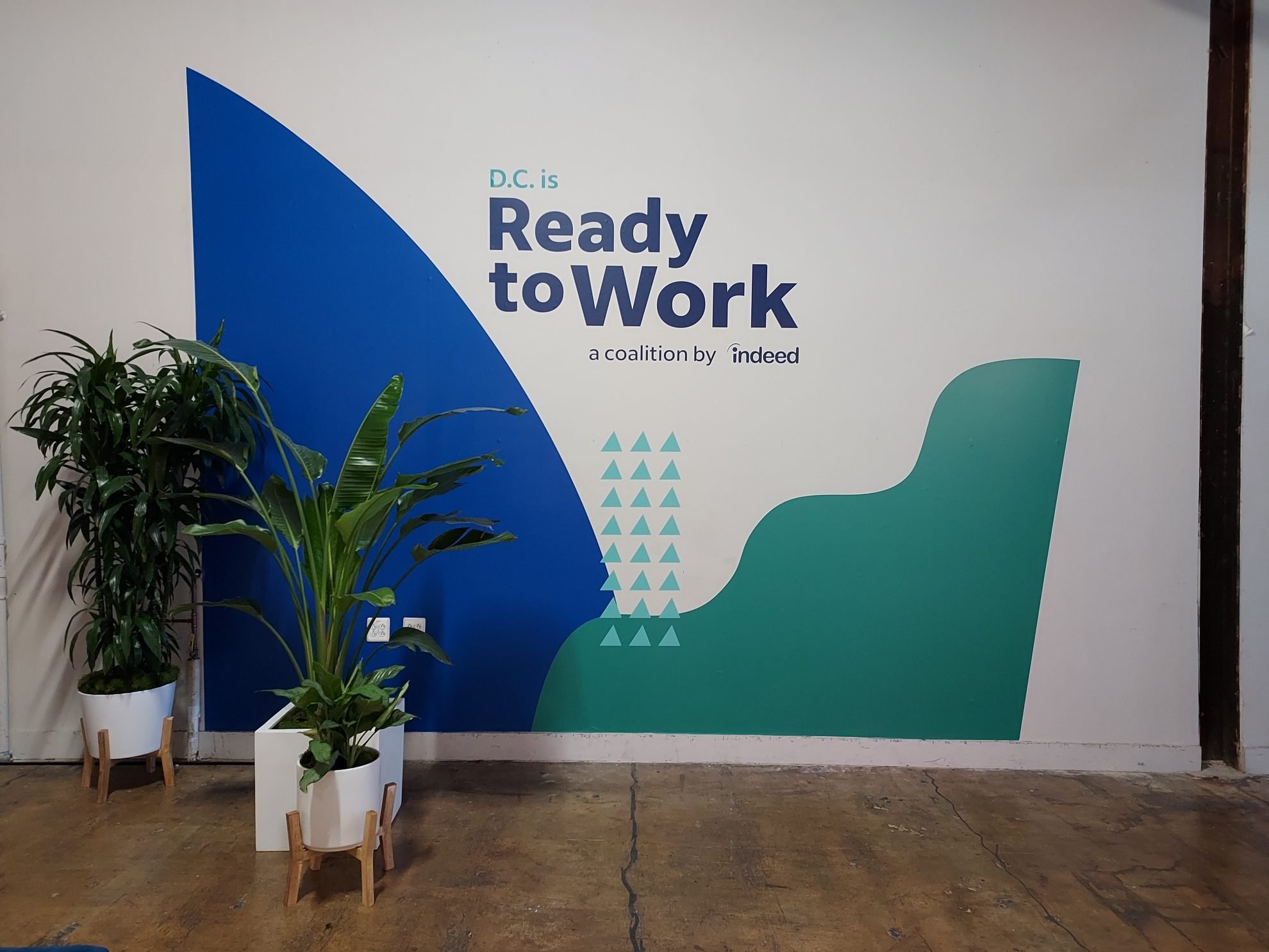
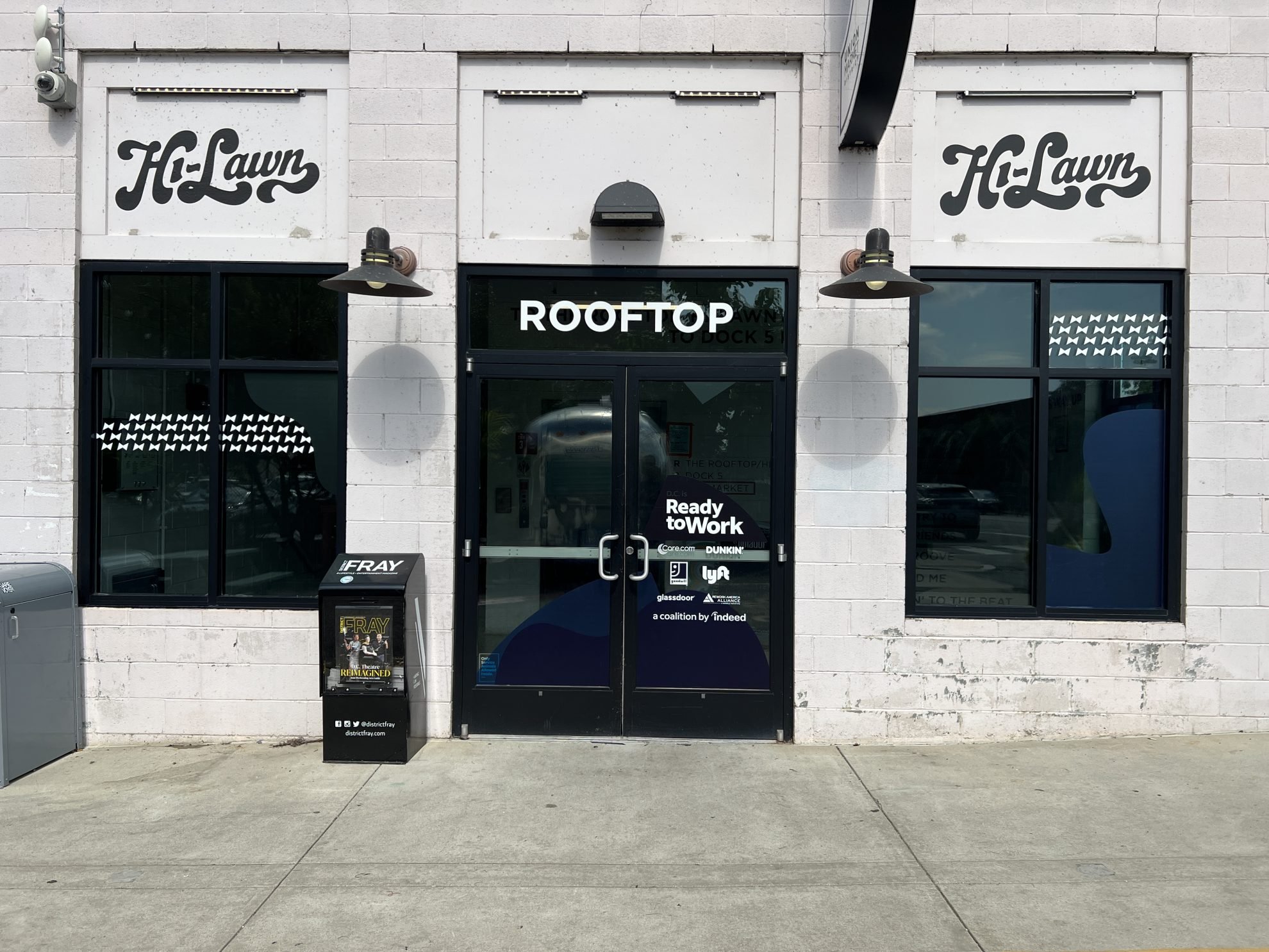
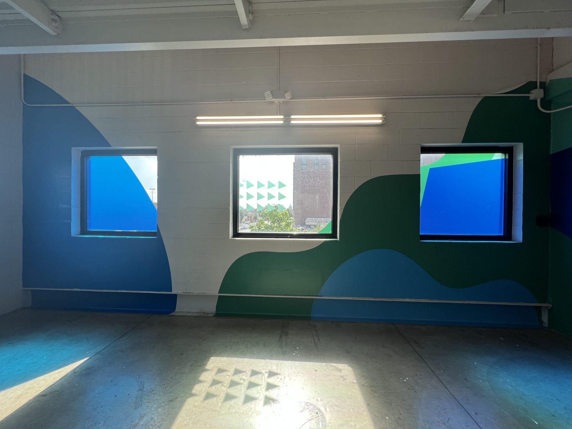
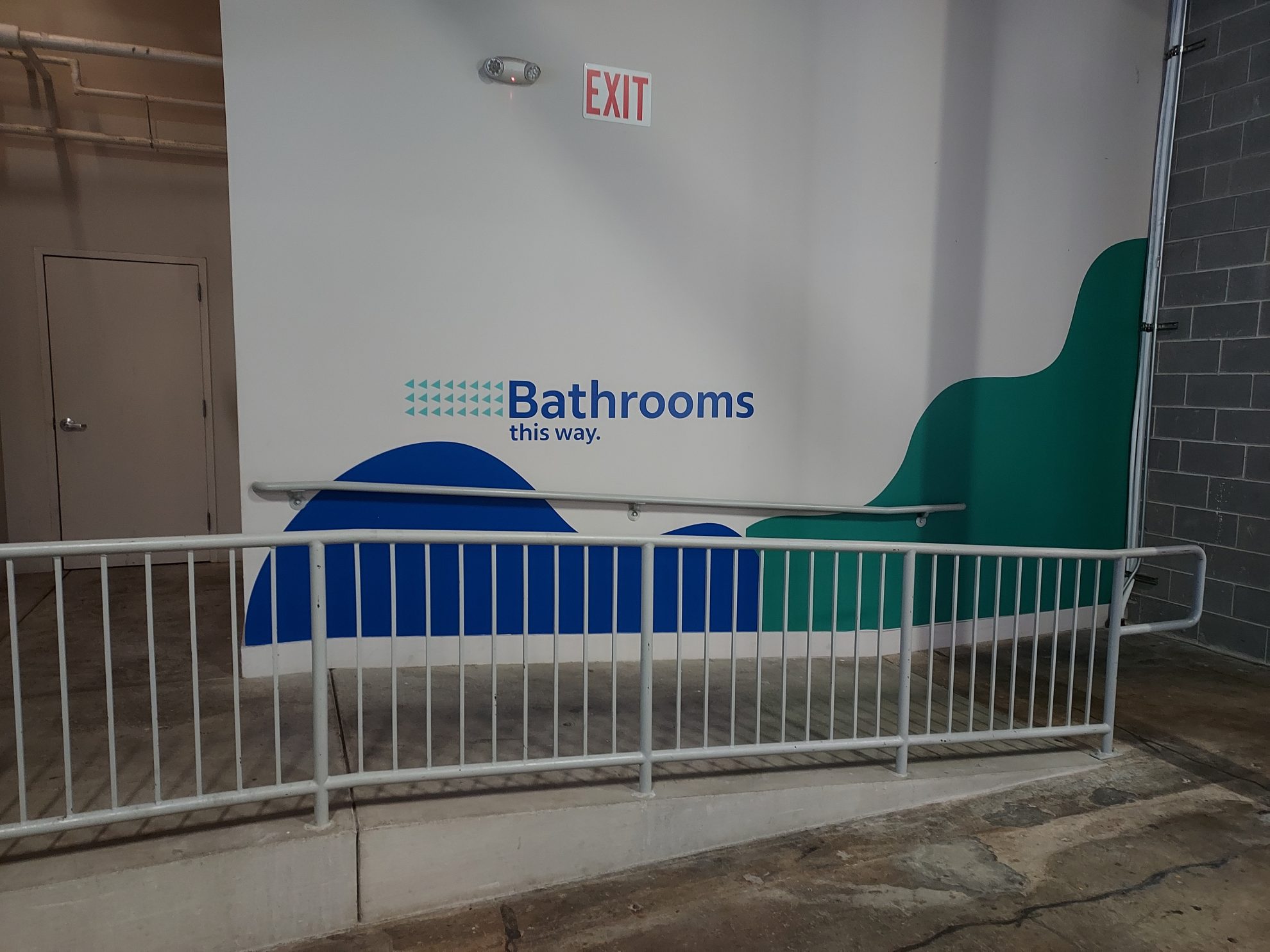
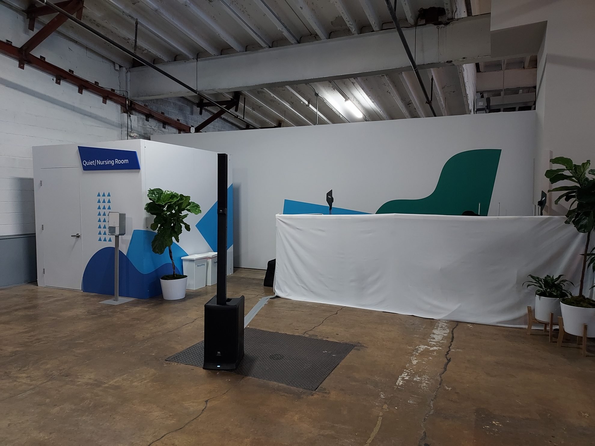
Heritage Signs & Displays' collaboration with The Gathery to brand Union Market in Greenville, SC, for Indeed's "Ready to Work" job fair. The project included custom event displays, wall graphics, window graphics, and wayfinding signs, creating an immersive and visually appealing environment. The branding enhanced the venue, reflected the event's mission, and provided a seamless experience for attendees.